Logos and the visual side of branding
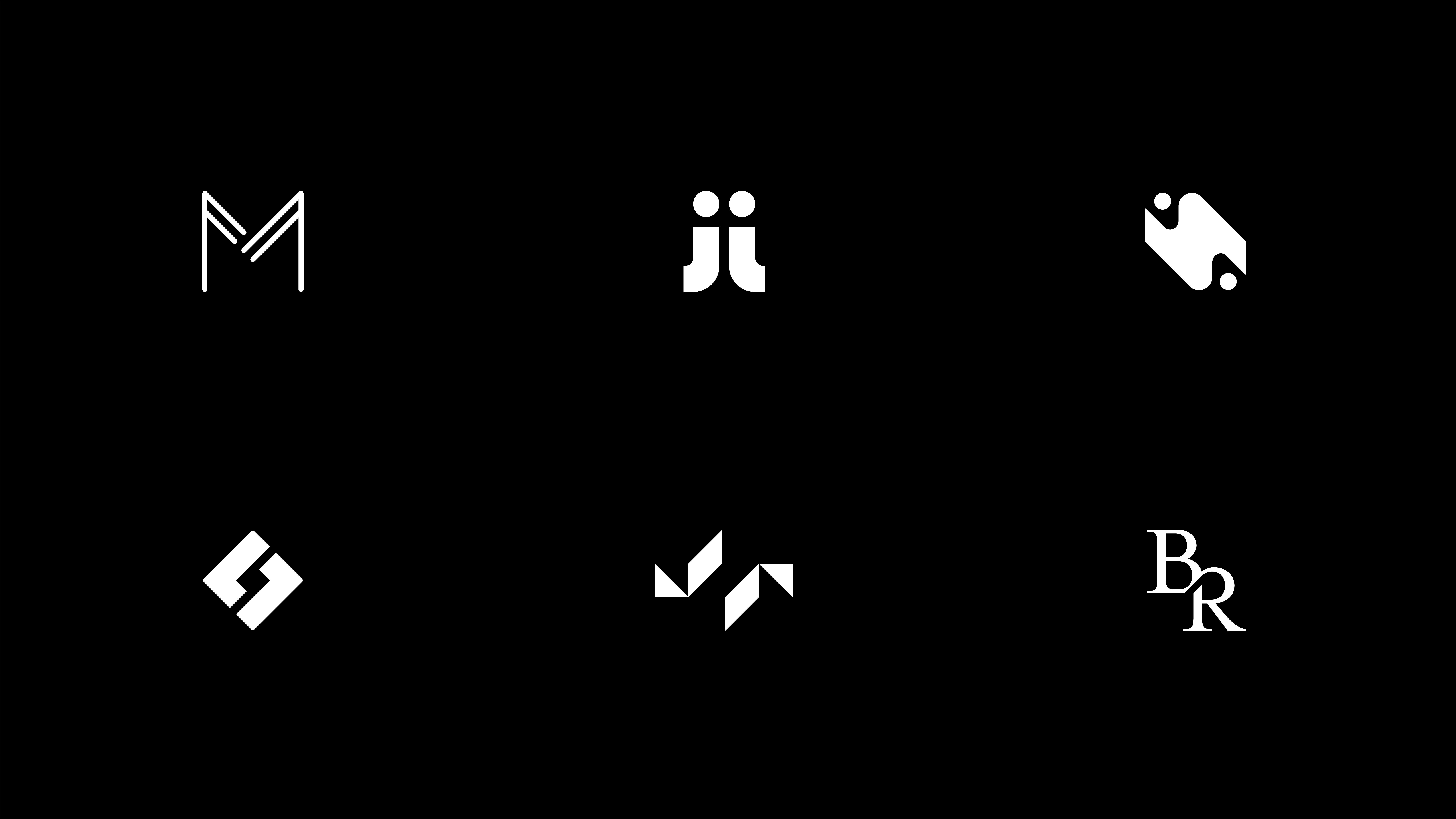
Here's a little collection of some past visual identity projects focusing on logos, colors, graphics and imagery.
This brand design has a classy and luxurious feel with an elegant wordmark while the colors are both calm and regal. The addition of graphics on packaging and marketing materials play well with the hairline style features of the logo.
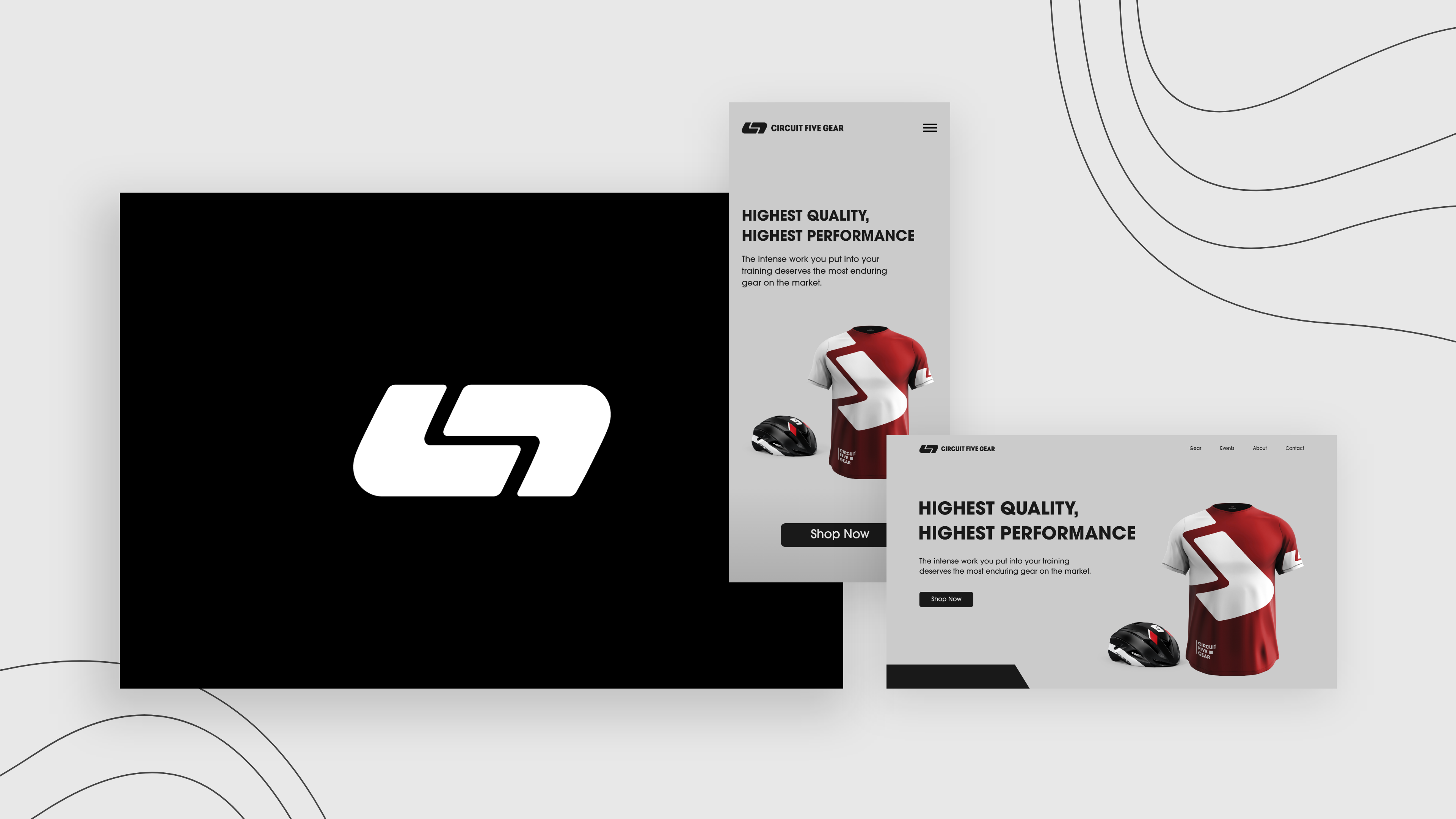
Bold and chunky to catch the audiences eye during a race, this brandmark was carefully designed to represent course circuitry and tire treading. When you view the negative space in the center of the logo you will see the number five from the brand name.
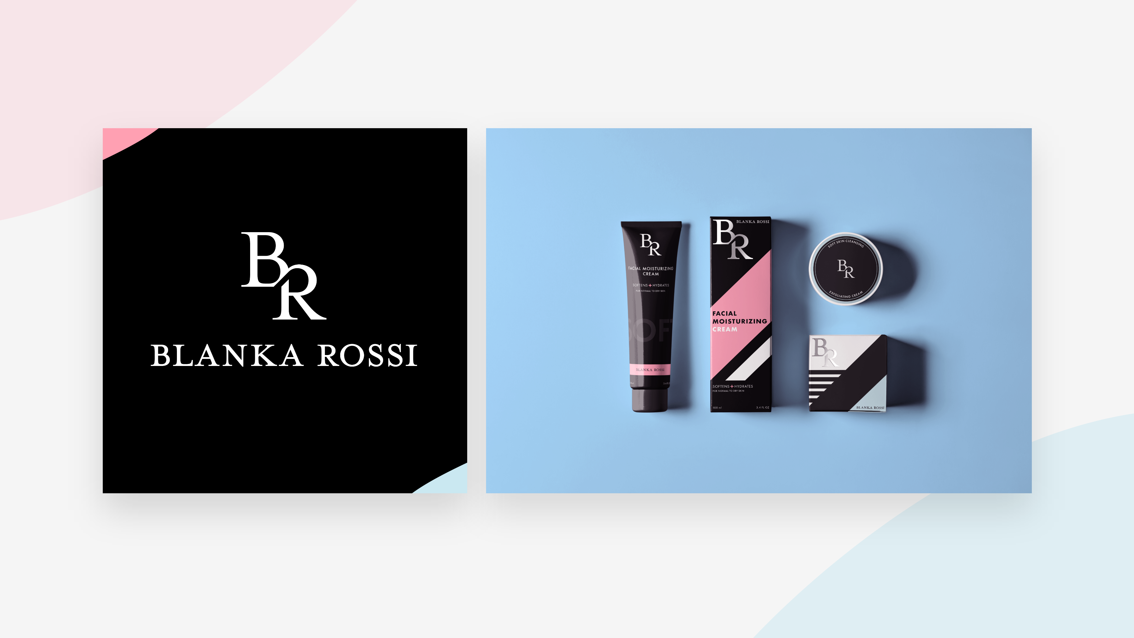
This lettermark was designed to feel classy and timeless but also modern, given the younger demographic the brand caters to. Overall the brand has a softer palette, so to help stand out on retail shelves larger contrasting shapes move through the packaging. The lettermark was also given a metallic shimmer to catch the eye of consumers.
.jpg)
.jpg)
.jpg)
.jpg)
Logos and the visual side of branding
Here's a little collection of some past visual identity projects focusing on logos, colors, graphics and imagery.
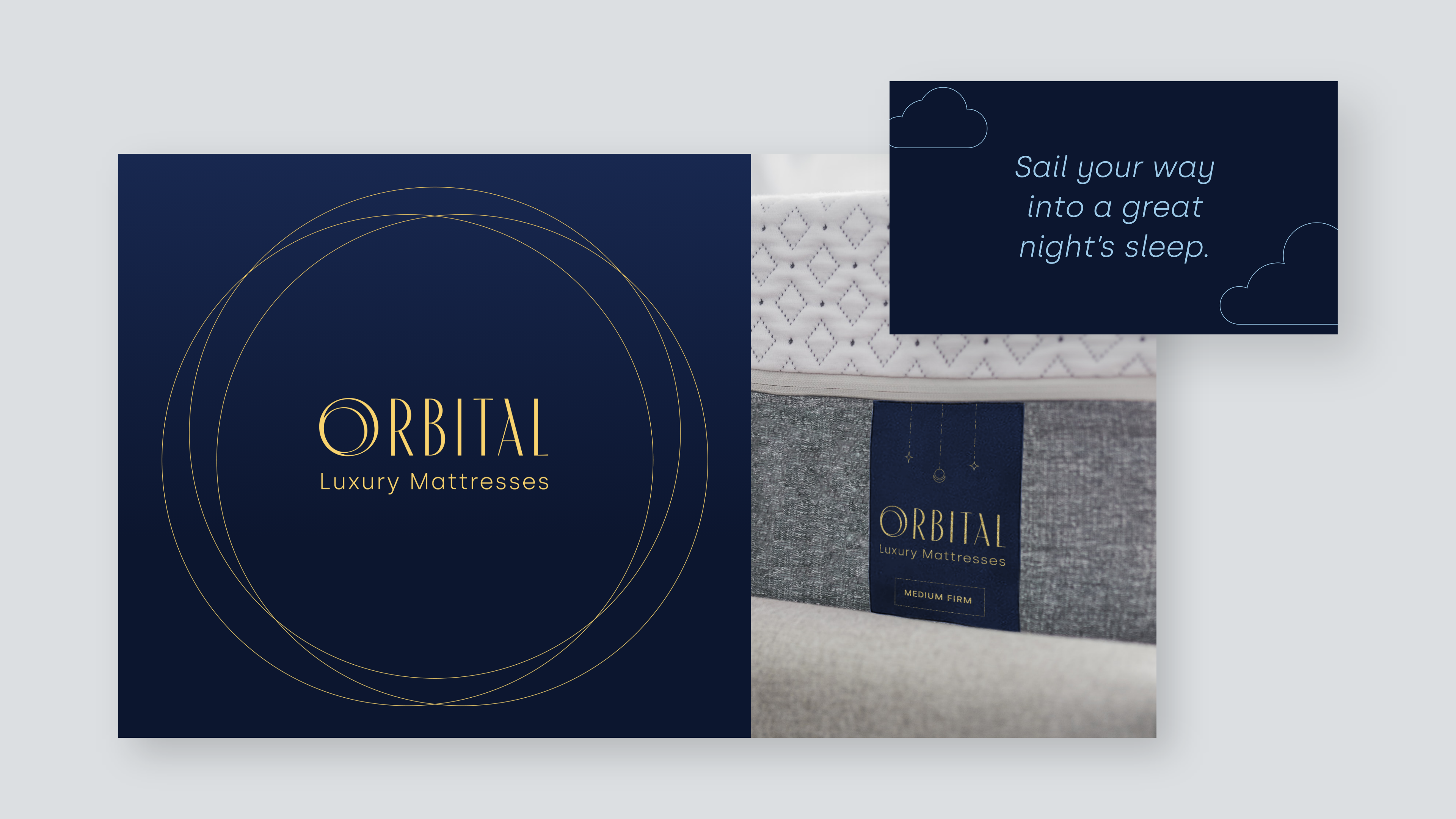
This brand design has a classy and luxurious feel with an elegant wordmark while the colors are both calm and regal. The addition of graphics on packaging and marketing materials play well with the hairline style features of the logo.

Bold and chunky to catch the audiences eye during a race, this brandmark was carefully designed to represent course circuitry and tire treading. When you view the negative space in the center of the logo you will see the number five from the brand name.

This lettermark was designed to feel classy and timeless but also modern, given the younger demographic the brand caters to. Overall the brand has a softer palette, so to help stand out on retail shelves larger contrasting shapes move through the packaging. The lettermark was also given a metallic shimmer to catch the eye of consumers.

